Share Post
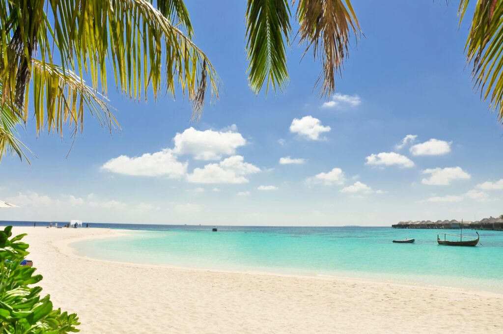
Hey there, design lovers. Let’s take a journey across turquoise waters, sunlit palms, and colorful village shutters — and bring that island energy into your very own walls. In today’s interior world, Caribbean-inspired hues are having a stylish renaissance — but with a more grounded, layered approach than the postcard-perfect tropics of the past. Let me walk you through how to build a fresh, current Caribbean palette for your home — one that’s not cliché, but vibrant, warm, and full of soul.
The New Mood for Caribbean Color in 2025
Before we pick paint chips, let’s talk context. What’s shifting in interior design right now — and how does that affect how we use tropical color?
- Warming up the coastal palette — Instead of icy aquas and super-bright whites, the trend is toward deeper, earthy tones, warm neutrals, and layered textures. Think of seafoam green meeting clay pink or sandy warm ivory as a base.
- Depth & richness over “flat pastels” — Designers are injecting moody greens, smoky teals, and terra-cotta into coastal interiors to give them more personality and weight.
- Biophilia & texture — As the biophilic design movement grows, color palettes are leaning into nature: botanical greens, mossy tones, and natural materials become part of the palette, not just the accents.
- Quiet statements — In 2025, boldness doesn’t always shout. It whispers. A dramatic wall or accent in coral or deep teal can do more work than everything screaming bright.
These shifts mean that your Caribbean-inspired home doesn’t have to feel kitschy — it can feel elegant, grounded, and utterly livable.
The Core Caribbean Palette: Foundations & Accents
When I build a Caribbean color scheme today, I like to think in layers: a neutral foundation, middle tones (the connector hues), and accent pops. Here’s a working palette formula you can adapt.
| Role | Example Hues | Why They Work |
|---|---|---|
| Foundation / Base | Warm ivory, soft sand, light taupe, “Malabar” neutral | Sets a calm backdrop so stronger colors don’t compete. (Sherwin-Williams’ 2025 “Malabar” is one such neutral in the trending capsule) Sherwin-Williams |
| Connector / Midtones | Sage green, muted teal, seafoam, oyster gray | These hues bridge neutral to accent without jarring contrast. |
| Accent / Pop | Coral / salmon, rich turquoise, jungle green, “Chartreuse” yellow-green | Use sparingly to bring energy, focal points, and that island fire. (SW’s 2025 “Chartreuse” is a lively tropical-ish accent in their color capsule) Sherwin-Williams |
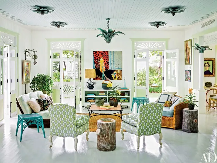
For example: walls in a creamy warm sand, trim or built-ins in soft oyster gray, a sofa in muted teal, and throw pillows or artwork in coral + jungle green.
I also love how classic Caribbean palettes lean on cool blues, warm corals, dramatic deep tones, balanced by soft neutrals.
Room-by-Room Strategies & Tips
Let’s get practical — here’s how I’d apply this system through different spaces in your home.
Living Room & Common Areas
- Walls: Go with the warm neutral base (ivory, pale sand). If you want drama, an accent wall in a deeper teal or mossy green works beautifully.
- Ceiling & Trim: In 2025, the “fifth wall” (ceiling) is getting love — you can carry a very pale midtone up there to soften transitions.
- Furniture / Upholstery: Use connector tones — muted teals, sage greens, or oyster grays — for large pieces so they can flex with accent changes over time.
- Accents & Decor: Bring in coral, chartreuse, or rich tropical green in cushions, vases, woven baskets, or a painted side table. Use these in limited doses to “pop.”
- Texture & Materials: Rattan, seagrass, jute, and raw wood soften vibrant color and anchor the palette.
Bedroom / Rest Zones
- Calm accent: Choose a soft midtone like seafoam or muted teal for a headboard wall or wardrobe. It adds character without overstimulation.
- Layered neutrals: Use the warm foundation shade on walls, then introduce slightly deeper neutrals (light taupe, oyster) in bedding and rugs.
- Accent touch: A coral throw, tropical-print pillow, or botanical art gives the space that island feeling without overdoing it.
Kitchen / Dining
- Cabinets: If you’re bold, try lower cabinets in jungle green or teal; pair with upper cabinets in neutral sand/ivory.
- Backsplash or tile: A decorative tile in turquoise or aquamarine can act as accent while still being functional.
- Accessories: Dishes, glassware, and textiles are great places for chartreuse or coral pops.
- Wood tones: Dark wood or walnut (which is making a comeback in coastal design) pairs well with tropical hues.
Bathrooms & Smaller Spaces
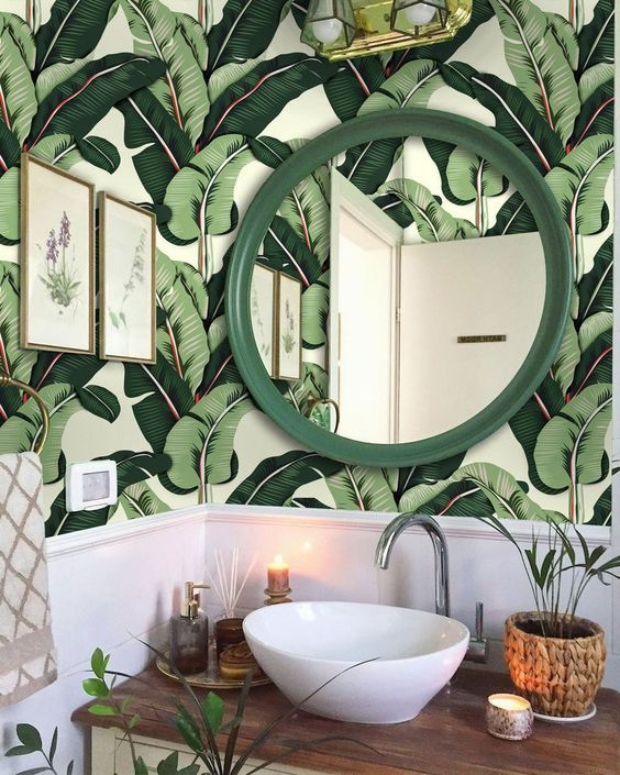
- Bold small rooms: Embrace deep accent walls in greens or coral. Because bathrooms are smaller, a dramatic color won’t overwhelm.
- Neutral base: Keep a pale neutral for ceilings, doors, and trim to let accent hues breathe.
- Tile & fixtures: White or off-white tiles with accent border strips in tropical hues create a crisp, clean look.
Tips for Balance & Longevity
- Limit your palette — Pick 3–5 hues maximum (including neutrals). Too many bright colors turn chaotic.
- Use repetition — Carry a coral or green across rooms in small doses (pillows, a vase, a lampshade) for cohesion.
- Mind the lighting — Natural light brings out the blue/green side of tropical hues, while artificial warm light brings out red/orange tones. Always test swatches at different times of day.
- Accent wisely — Bold colors shine on smaller elements (doors, accent furniture, artwork). Let the neutrals do the heavy lifting.
- Texture is your ally — Use woven materials, raw fabrics, stone, and imperfect finishes to soften transitions between bold hues and neutrals.
- Be adaptive — Because trends shift, keep your core (neutrals + midtones) flexible, and change accent items seasonally if you like.
Why This Approach Feels Fresh & Local
As someone who’s deeply rooted in Caribbean sensibility, authenticity matters. The palette I’m advocating reflects not just the obvious tropics, but the in-between: the muted greens of hills, the sand after sunset, the deep teal of deeper sea. It feels lived-in, elegant, and flexible — not a forced “vacation home” cliché.
Plus — it aligns with today’s design currents: warm coastal shifts, deeper tones, biophilic textures, and quiet drama. You get the island vibe and the polish.
1 Comment
About Me

A Life Designed With Intention
Welcome to Eat.Live.Design — for women who want their home, food, and lifestyle to reflect who they are and how they want to feel.
Here you’ll find nourishing recipes, timeless home inspiration, and simple habits that bring ease, clarity, and meaning to your everyday.
Hi, I’m Bev — passionate cook, home renovator, and believer in everyday elegance.
I’m glad you’re here.

Promo Box


love this! very helpful 🩵